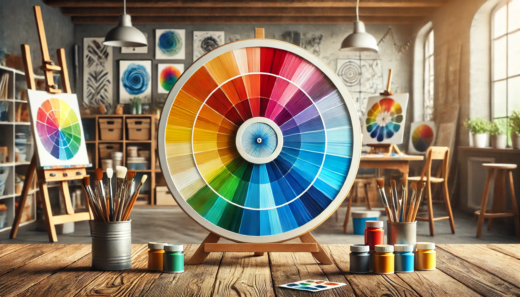
The color wheel is a fundamental tool for artists, designers, and anyone interested in the vibrant world of colour.
This guide explores the essentials of the colour wheel, including primary, secondary, and tertiary colours and how they interact within different colour models.
- Learn how to create harmonious colour schemes.
- Understand the benefits of using analogous and complementary colours in design.
Whether you’re experienced or just starting out, understanding these concepts will enhance your colour choices and elevate your work.
What is the Colour Wheel?
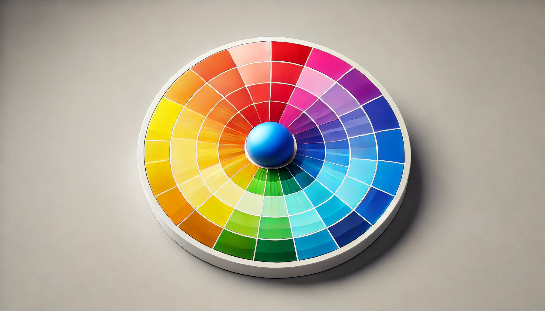
Ah, the colour wheel! This nifty little circular diagram is my trusty sidekick in the world of colour theory. It helps me figure out how primary colours, secondary colours, and those tricky tertiary colours play nicely with each other.
It’s basically the go-to visual guide for artists and designers like me, whether I’m mixing colours or crafting the perfect harmonious palette. The colour wheel is my roadmap through the sometimes baffling jungle of hues, saturations, and brightness levels, ensuring my creative projects are not just eye candy but also effective in getting the message across.
What are Primary Colours?
Primary colours are like the VIPs of the colour world—untouchable and impossible to create by mixing other pigments. In my colourful adventures, I often bump into two main models: RGB for my digital wizardry, which brings together red, green, and blue, and CMY for print, rocking cyan, magenta, and yellow.
These colour models are the secret sauce behind everything from eye-popping digital designs to timeless masterpieces. Getting a grip on them is a must for anyone dreaming of becoming the next Picasso or digital design guru!
What are the Three Primary Colours?
The three primary colours are like the holy trinity of colour mixing: red, blue, and yellow in pigment land, and red, green, and blue in the light realm. These colours are special little snowflakes—they can’t be created by mixing others, and they’re the building blocks for every other hue out there.
Whether I’m splattering paint like a modern-day Jackson Pollock or tapping away at my digital canvas, getting a grip on these primary colours is crucial for mastering the colourful chaos of mixing.
Picture this: a toddler gleefully smearing finger paints on a canvas. It’s like a chaotic symphony of creativity, resembling a rainbow that collided with a jellyfish. But hey, there’s a masterclass in colour theory hiding in there, even if it looks like a two-year-old’s art project gone rogue.
In the painting universe, red is all about that fiery passion, blue brings the calm vibes, and yellow? Well, it radiates happiness—like the colourful characters at a family reunion, minus the awkward small talk and questionable casserole dishes.
Digital artists wield these primary hues to whip up vibrant visuals on their screens, where a simple click can conjure combinations that would make even Picasso nod in approval (or at least raise an eyebrow).
So whether I’m crafting a masterpiece or doodling on a napkin, knowing how to mix these core colours can elevate my art from a mere scribble to something that might just end up on a fridge—or if I’m lucky, even a gallery wall!
What are the Primary Colours in Different Colour Models?
Primary colours can be a bit like that friend who insists on having different tastes depending on the occasion. Understanding these quirks is crucial. In the RGB model, which is my go-to for screens and digital art, the primary colours are red, green, and blue. But when it comes to printing, it’s all about CMY—cyan, magenta, and yellow take centre stage. Knowing the difference can change the game from graphic design to fine art, so I always check which model I’m using for my creative projects.
Picture this: I’m an artist on a quest, deciding whether to dive into a vibrant digital masterpiece or dust off my trusty inkjet printer for some eye-catching posters. If I’m in RGB territory, it’s like I’m throwing a colour disco party—perfect for lighting up my Instagram feed. But if I venture into the CMY world, I’m wading through inks and pigments, mixing colours like a mad scientist in delightful chaos.
Each model has its loyal fans and quirky traits—RGB makes screens glow like a nightclub, while CMY gives my printouts that lovely, “I’m an actual piece of art” vibe. Choosing the right one could mean the difference between a dazzling work of art and a colourful blob that leaves people scratching their heads.
What are Secondary Colors?
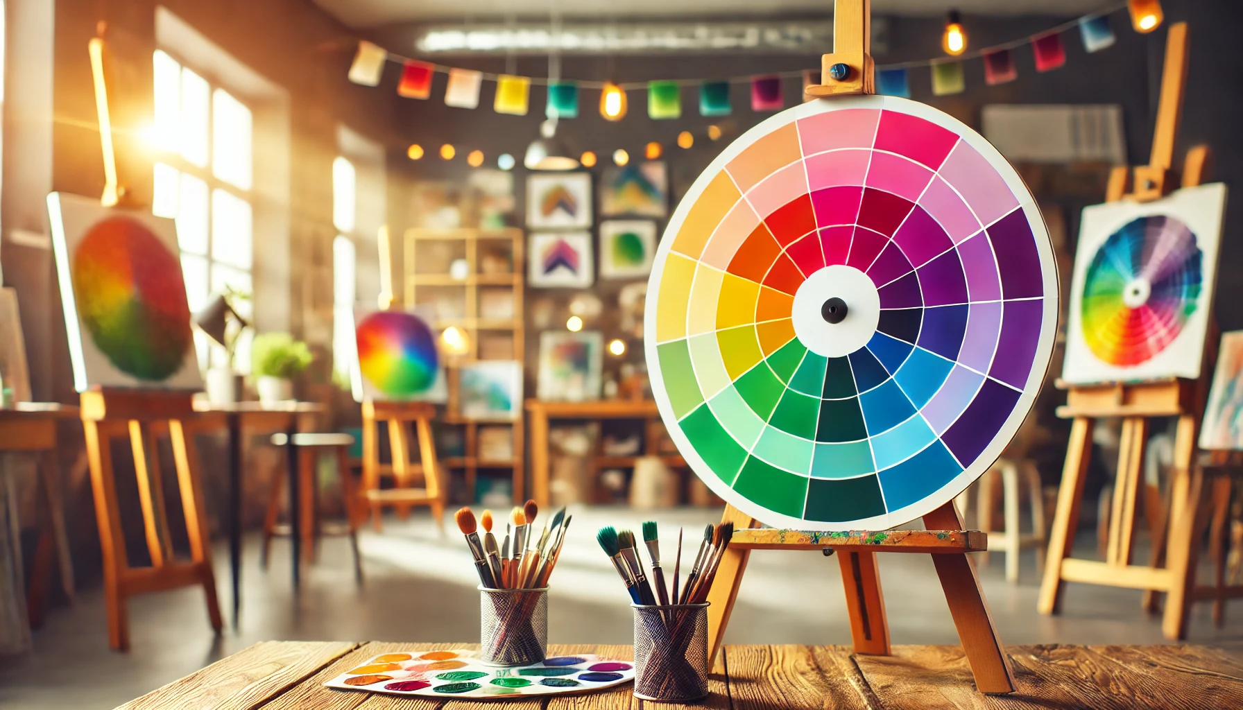
So, once I’ve wrapped my head around the magic of primary colours, it’s time to dive into the colourful playground of secondary colours, which pop into existence when primary colours decide to mingle!
By mixing these lively shades, I conjure up the fabulous trio of green, orange, and purple. Not only are these secondary colours a feast for the eyes, but they also play a starring role in the symphony of colour harmony and composition.
They open the door to a treasure trove of creative possibilities in visual arts and design—let the colour adventure begin!
How are Secondary Colours Created?
Creating secondary colours is like whipping up a fun little recipe in the kitchen: grab one part primary colour and mix it with another! Take red and blue, stir them together, and bam—purple! Toss in blue and yellow, and you’ve got yourself a lively green.
This playful colour mixing not only results in a visual feast but also gives me a deeper appreciation for how colours interact in the wild world of design.
Just picture it—when the fiery warmth of red gets cosy with the cool serenity of blue, they whip up a rich, royal purple that’s practically begging for attention. Meanwhile, the cheerful combo of blue and yellow brings to mind sunny days and lush landscapes, creating a sense of harmony that’s sure to brighten any artwork.
Artists and designers can wield these magical pairings to stir up emotions or set the mood, making their art not just a treat for the eyes, but a whole experience that resonates.
It’s this delightful dance of colours that transforms a plain canvas into something extraordinary, sparking imagination with every brushstroke!
What are the Secondary Colours in Different Colour Models?
Just like primary colours have their quirks across different colour models, secondary colours are no wallflowers either! In the RGB colour model, we get the daring trio of cyan, magenta, and yellow, strutting their stuff from the primary colours.
Meanwhile, in the CMY model, it’s a whole new party with red, green, and blue, showcasing the wild and wonderful world of colour mixing.
Now, RGB is the life of the digital art party, where screens come alive with vibrant hues that could make a rainbow jealous. On the flip side, the CMY model takes centre stage in the printing realm, making sure your cherished photos leap off the page like they just won the lottery.
Picture this: a digital artist crafting a stunning sunset splashed with rich yellows and blues, only to have a graphic designer swoop in and transform that beauty into a CMY marvel, all in the name of print perfection.
Whether you’re after that jaw-dropping intensity for a YouTube thumbnail or nailing the perfect colour for your business cards, getting to know these secondary colours and their relationship can turn a simple image into an absolute masterpiece!
What are Tertiary Colors?
Tertiary colours are like the fabulous offspring of the primary and secondary colours, mixing it up to create some delightful hues like red-orange and blue-green! These colours are the secret ingredient that adds depth and sophistication to my colour palettes, acting like that final sprinkle of glitter on a masterpiece.
Whether I’m whipping up a colour gradient or diving into artistic colour schemes, knowing my tertiary colours is the key to taking my visual designs from “meh” to “wow!”
How are Tertiary Colours Created?
Creating tertiary colours is like embarking on a colourful adventure! Just grab a primary colour and mix it with a neighbouring secondary colour, and voilà! You’re cooking up fabulous shades like yellow-orange or red-purple.
This delightful little experiment not only expands my colour palette but also gives me a crash course in the delightful dance of colour relationships in art and design.
Picture this: whipping up a zesty yellow-green or a sultry blue-violet, each one adding its own special pizzazz to my creations. Tertiary colours are like the secret spice of the colour wheel, perfectly balancing those bold primary shades with their quieter secondary friends.
These hues don’t just add richness to my artwork; they create eye-popping contrasts and harmonious vibes that can stir up all sorts of emotions. So, whether I’m a seasoned artist or just a curious dabber, diving into these splendid combos can seriously up my creative game, turning simple projects into mesmerising masterpieces!
What are the Tertiary Colours in Different Colour Models?
Tertiary colours are like the quirky sidekicks of the colour world, adding a splash of surprise to my understanding of colour theory. In the RGB model, I’m playing with shades like red-violet and yellow-green, while in the CMY model, things get even funkier with blue-violet and orange-yellow. Grasping these variations is crucial for me as an artist or designer trying to pick the perfect colours for my masterpieces.
These vibrant hues don’t just jazz up a palette; they pack a punch with their emotional and visual vibes, making them absolutely essential from branding to interior design. Take a logo designer, for example—they might reach for that bold red-violet to unleash a wave of passion and creativity. Meanwhile, an interior decorator might cosy up to soft yellow-green to create a serene, welcoming vibe.
The way light and pigment dance across these models adds layers to my creative projects, opening up a world of possibilities and igniting my imagination in visual storytelling.
How to Use the Colour Wheel in Design?
Using the colour wheel in design feels like having a trusty sidekick right there with me! This little gem helps me navigate the wild world of colour harmony and selection, making it easy to whip up stunning colour schemes that totally resonate with my audience.
Whether I’m a design ninja or just a novice with a dream, mastering the colour wheel takes my projects from snooze-fest to showstopper in no time!
What is Color Harmony?
Colour harmony is like the secret sauce that makes my designs not just look good, but feel good too. It’s all about arranging colours in a way that’s visually pleasing, and luckily for me, the colour wheel is my trusty sidekick in this quest for colour perfection. When I get colour harmony right, it’s like I’ve created a feast for the eyes!
Picture this: walking into a room where every colour is performing a synchronised dance, versus one where hues are clashing like siblings fighting over the last slice of pizza. Not exactly a vibe, right? The colour wheel sorts colours into primary, secondary, and tertiary categories, making it easy for me to pick complementary or analogous colours without breaking a sweat.
For instance, if my project is feeling more like a wild circus than a calm art installation, I can turn to analogous colours to bring some zen to the chaos. Mastering colour harmony is like playing Tetris—just when I think I’ve nailed the perfect balance, a rogue colour pops up to throw my masterpiece off course!
What are the Different Color Harmonies?
There are so many delightful types of colour harmonies out there, each with its own flair—think of them as the fashion choices of the art world! You’ve got complementary colours, which are like the dynamic duo of the colour wheel, sitting opposite each other and throwing a vibrant party.
Then there are analogous colours, cosying up next to each other and creating that chill, cohesive vibe everyone loves. Understanding these colour combos gives me the power to make design choices that truly resonate with my audience!
Oh, and let’s not forget the triadic colour schemes—three colours evenly spaced around the wheel, ready to bring a playful, dynamic energy to my designs. Pairing blue, red, and yellow? Instant cheerful atmosphere that’s just begging to be used for kids’ products!
Then there’s the classic monochromatic harmony—just a whole bunch of shades of the same colour, coming together like a well-rehearsed choir. This subtle approach can add a touch of sophistication, perfect for branding that’s aiming for that minimalist aesthetic.
By getting a grip on these concepts, I can really elevate my design game, whether I’m whipping up a striking poster or crafting a cosy interior space!
How to Create Colour Schemes Using the Colour Wheel?
Creating a colour scheme using the colour wheel is like whipping up my own signature dish! By mixing and matching colours based on their relationships in the wheel, I can whip up a palette that makes my designs sing. Whether I’m in the mood for bold contrasts or softer harmonies, mastering the colour wheel lets me choose the perfect colours for any project.
Just like a chef balances flavours, I’ve got to consider the dance of hues. I start with the primary colours—red, blue, and yellow—and then dive into the delightful world of secondary and tertiary colours that come from mixing them up.
For a visual punch, I love playing with complementary colour schemes; after all, opposites attract! It’s like throwing a party where every colour is invited, creating that electric buzz that makes designs pop.
And let’s not forget about saturation and brightness! A little tweak here and there can elevate my palette from “meh” to “wow!” So, I roll up my sleeves and let my creativity flow—because mastering the colour wheel is my secret ingredient for designing with flair!
What are Analogous Colours?
Analogous colours are like the best mates of the colour wheel, cosy up next to each other and crafting those oh-so-harmonious palettes! They’re like the perfect brunch crew, working together to create a vibe that’s all about peace and cohesion, ready to elevate any design.
When I use these colours wisely, they magically boost the aesthetics of my work, making it not just visually stunning but also emotionally engaging. Who knew colour could be so charming?
How are Analogous Colours Created?
Creating analogous colours is as easy as pie—if pie were a colour wheel! Just grab a primary or secondary colour and mix it with its friendly neighbours on the wheel. For example, kick off with blue, throw in some blue-green and blue-violet, and voilà! You’ve got an eye-catching trio that’s more harmonious than a well-rehearsed choir.
This technique doesn’t just make your artwork look like it was whipped up by a colour wizard; it can breathe life into everything from your paintings to your interior design. Picture a cosy living room where shades of orange, yellow-orange, and yellow come together like best friends at a coffee shop, delivering all the right vibes of warmth and comfort.
Now, envision a vibrant landscape painting where green, blue-green, and teal team up to create a seascape so stunning it could make Neptune green with envy. So whether you’re slapping paint on a canvas or giving your home a makeover, keep those colour schemes flowing for a look that’s not just eye-catching but also harmonious—like a symphony of hues ready to serenade your senses!
What are the Benefits of Using Analogous Colours in Design?
Using analogous colours in design is like having my own secret weapon in the creative battlefield! These colours bring harmony and unity to the table, stirring up specific emotions and making everything look oh-so-pleasing to the eye.
When I opt for analogous colours, my designs feel like they’re throwing a cosy party, drawing in viewers with ease.
Picture this: walking into a room drenched in soft greens and blues—immediately calming, right? That’s the magic of these harmonious shades at work. When I use them wisely, they guide the viewer’s eye across the canvas like a well-choreographed dance, creating a delightful visual journey.
Not only do these colours help craft an atmosphere that resonates with the intended message, but they also sprinkle in a touch of subtle sophistication that can elevate any artwork or space.
It’s like rocking a perfectly coordinated outfit—effortless charm that turns heads without breaking a sweat!
What are Complementary Colours?

Complementary colours are like the dynamic duo of the design world, ready to add a serious pop of excitement!
They sit directly across from each other on the colour wheel, creating a visual smackdown of contrast and interest when they team up. Mastering the art of using these colour opposites can take my designs from snooze-fest to wow-factor, making my compositions dynamic and engaging enough to grab anyone’s attention.
Who knew a little colour rivalry could amp up my creative game so much?
How are Complementary Colours Created?
Creating complementary colours is like a game of colour hide-and-seek—just look across the colour wheel for that perfect match! If I pick blue, then orange is my dazzling counterpart. This pairing doesn’t just spice things up; it injects depth and energy into my designs!
Picture this: I’m painting a vibrant sunset where those fiery oranges and rich blues are waltzing together, instantly grabbing everyone’s attention. In design, I might use this strategy when crafting a logo, making those contrasting hues pop like popcorn at a film.
Want to make a call-to-action button on a website impossible to ignore? Just wrap it in its complementary colour and watch it strut its stuff. Grasping these colour dynamics not only makes my work visually stunning but also stirs up emotions, ensuring my artistry resonates like a catchy tune with its audience.
What are the Benefits of Using Complementary Colours in Design?
Using complementary colours is like throwing a party in my design world—it’s all about that splash of excitement! These colour combos create eye-popping contrasts that grab attention and make my message sing. Understanding the magic of complementary colours means I can whip up designs that are not just pretty pictures but also effective communicators.
Just picture it: the vibrant oranges shimmying with calm blues or fiery reds sparking off peaceful greens—it’s a visual feast that’s hard to look away from! These combos don’t just make things look good; they also stir up specific emotions. For example, when I pair a warm colour with its cool sidekick, I can evoke feelings that range from cosy warmth to serene balance.
This playful dance of colours not only amps up the engagement but also helps my crafted messages hit home emotionally, boosting both understanding and retention. In a world where visuals are thrown at us like confetti, mastering complementary colours is my secret weapon for making content truly memorable and irresistibly captivating!
Frequently Asked Questions
What is the colour wheel and why is it important?
The colour wheel is a visual representation of the colours in the spectrum, organised in a circular format. It is important because it helps us understand the relationships between colours and how they can be combined to create different shades and hues.
What are primary colours?
Primary colours are the three colours that cannot be created by mixing any other colours. They are red, blue, and yellow, and they are the building blocks for all other colours on the colour wheel.
What are secondary colours?
Secondary colours are created by mixing equal amounts of two primary colours. They are orange (red + yellow), green (blue + yellow), and purple (red + blue).
What are tertiary colours?
Tertiary colours are created by mixing a primary colour with a secondary colour. They are located between the primary and secondary colours on the colour wheel and are named with a combination of the two colours they were mixed from (i.e. red-orange, yellow-green, blue-violet).
How can I use the colour wheel to create a colour scheme?
The colour wheel can help you choose colours that go well together by using different colour schemes. You can choose complementary colours (opposite on the wheel), analogous colours (next to each other), or triadic colours (equally spaced).
Can I create my own colour wheel?
Yes, you can create your own colour wheel by using paint, markers, or coloured pencils. Start with the three primary colours and then mix them to create the secondary and tertiary colours. It’s a fun and creative way to understand the colour wheel better!
