Understanding paint colour theory is essential for anyone looking to enhance artistic skills or transform a space with colour.
This article unpacks the fundamentals of colour theory, exploring primary, secondary, and tertiary colours, as well as concepts like warm and cool tones.
It delves into how to create colour harmony, choose effective colour schemes, and employ techniques to add depth and contrast.
The psychological effects of colour are examined, along with common mistakes to avoid.
Whether you’re a budding artist or a design enthusiast, this guide equips you with the knowledge to make informed colour choices.
What Is Paint Colour Theory?
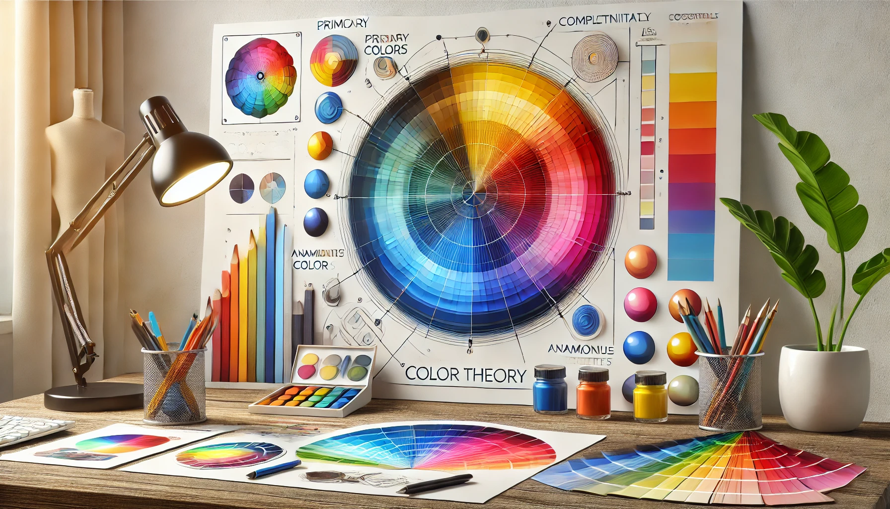
Paint colour theory is like a treasure map for anyone navigating the colourful realm of visual arts. It’s all about how we see and play with colours, helping artists and designers whip up eye-popping compositions and designs that practically sing.
I mean, who doesn’t love a good colour wheel? It neatly organises primary, secondary, and tertiary colours, giving me the scoop on how to mix and match like a pro.
But it’s not just about pretty palettes; colours also have some serious emotional and psychological mojo. Engaging with colour theory turns me into a colour wizard, letting me craft combos that not only look good but also resonate with audiences.
Plus, I get to take into account the cultural vibes of colour. It’s like painting with purpose!
The Basics of Color Theory
Diving into the basics of colour theory is like cracking open a treasure chest loaded with hues and shades. The colour wheel is my trusty map in this vibrant adventure, sorting out primary, secondary, and tertiary colours to help me make sense of their relationships and how they mix.
Each colour has its own personality—think hue, saturation, and value—all of which play a role in how they mingle and impact our perceptions in design and art. By getting a grip on these fundamentals, I’m ready to wield my colour knowledge like a wizard with a paintbrush, cranking up my artistic innovation to a whole new level.
Primary Colors
In colour theory, primary colours are like the VIPs of the colour world; they’re the foundation of all other colours and don’t get mixed from anything else. We’re talking about red, blue, and yellow—the holy trinity of hues.
By mixing these primary pigments in just the right proportions, I can whip up a rainbow of colours, showcasing the magical alchemy that fuels my artistic flair. Understanding these primary colours is essential for anyone looking to create, as they’re the building blocks of my ultimate colour palette.
These primary shades don’t just stop at being the base for secondary colours like green, orange, and purple; they also sprinkle some extra charm into the creation of tertiary colours, making my artistic expression as rich as my coffee.
Take red and yellow, for instance—mix those two, and voilà! I’ve got orange, proving that the colour wheel is basically one big, happy family. I often rely on these combos to stir emotions or set the mood in my masterpieces.
By mastering the primary colours and their mixing potential, I can achieve nuanced shades and tones that add depth and vitality to my creations—because who wants flat colours when you can have a vibrant explosion of life?
Secondary Colors
Secondary colours are like the fun party crashers of the colour world, popping up when I mix two primary colours together. We’re talking about vibrant green, zesty orange, and regal purple—each one a key player in expanding my colour wheel.
When I blend those primary colours in equal parts, I get these eye-catching hues that can really jazz up my artwork and designs. Understanding secondary colours lets me unleash my inner creative genius and explore a whole new playground of possibilities.
These colours don’t just sit there; they serve as a bridge between the trusty primary colours while offering a treasure trove of emotions and themes. For instance, green whispers of nature and tranquillity, orange bursts with energy and warmth, and purple struts in with vibes of luxury and creativity.
When I weave these hues into my colour schemes, they can dramatically shift the overall aesthetic, guiding the viewer’s emotions and keeping my compositions in harmony. Whether I’m diving into graphic design, painting, or sprucing up my living space, mastering the mix of these colours can lead to visuals that not only engage but also inspire.
Tertiary Colors
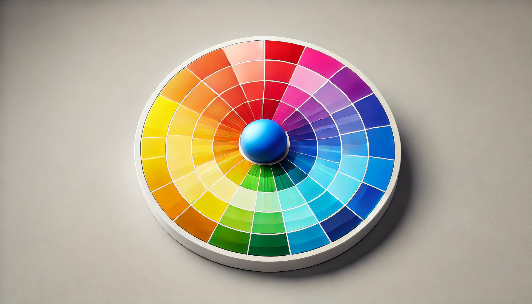
Tertiary colours are like the delightful middle children of the colour wheel—those unique shades you get when you mix primary colours with their adjacent secondary mates. Think red-orange and yellow-green; they’re the nuanced hues that add a splash of depth to any artistic endeavour.
Mastering these rich colours isn’t just a party trick; it’s like having a secret key to unlock more complex visual stories in my work. With the right blend of tertiary colours, I can achieve that sweet spot of colour balance and harmony in my creations.
In the art world, these intermediary colours are mood-makers. They create dynamic contrasts and focal points that make people say, “Wow, what’s that?” For example, a vibrant red-orange can set the room ablaze with warmth and energy, while a softer yellow-green whispers tranquillity and nature’s embrace.
Regarding branding and interior design, knowing how to play with tertiary colours is crucial for crafting palettes that resonate with the audience. It’s all about creating spaces and visuals that not only catch the eye but also feel inviting and warm.
By skillfully mixing these colours, I can elevate my narratives and draw viewers into a richer, more engaging experience. Who knew that a little colour wheel magic could make such a big difference?
Warm and Cool Colors
Warm colours like reds, oranges, and yellows? They’re like a shot of espresso for the soul—inviting energy and warmth into the room. Meanwhile, the cool colours—think blues, greens, and purples—are like a cosy blanket on a chilly night, wrapping you in calm and tranquillity. It’s wild how colour temperature can totally change how we experience art.
When an artwork is splashed with warm shades, it’s like throwing a party for the senses; passion and excitement leap out and practically pull the audience in for a dance. But flip the palette to cool colours, and it’s a whole different vibe—a soothing balm that encourages introspection and relaxation, perfect for serene landscapes or those meditative spaces where you can just breathe.
This colourful ballet not only takes the viewer on an emotional rollercoaster but also plays a sneaky role in design decisions. Take branding, for example. A logo decked out in warm hues screams vibrancy and innovation, while cooler tones whisper trust and dependability. It’s fascinating how effectively colour can shape our perception in both art and design—who knew hues could be so powerful?
Complementary Colors
Complementary colours are like the dynamic duos of the colour wheel—think red and green having a little colour party directly across from each other. When these colour pals team up, they create a contrast that’s so striking, it could make even the most boring artwork sit up and take notice.
This colourful dance lets artists create harmony and balance, pulling viewers in while packing an emotional punch. Mastering the art of complementary colours can seriously elevate my artistic game.
By pairing complementary colours with a bit of strategy, I can whip up some vibrant focal points that not only highlight specific areas but also add a dash of depth. For example, when I toss cobalt blue together with its complementary orange, I can transform a sunset scene into something that practically vibrates with life and drama, showcasing that delightful tug-of-war between light and shadow.
Graphic designers get in on the fun too, using complementary hues to whip up logos and adverts that grab attention faster than a cat chasing a laser pointer. Whether it’s through colour blocking or snazzy gradients, this harmonious yet contrasting combo can breathe life into any piece of art, engaging the audience on a level deeper than just “pretty colours.”
Analogous Colors
Analogous colours are like the best friends of the colour wheel—three hues hanging out right next to each other, creating a soothing vibe that’s just easy on the eyes. When I mix these colours, I’m not just throwing paint around; I’m crafting depth and unity while keeping my colour palette cohesive.
Using analogous colours is my secret recipe for emotional and visual resonance—think balance and harmony in a beautiful dance.
These colours usually feature one dominant hue with its trusty sidekicks, creating a smooth gradient that really enhances the aesthetic appeal. Take landscape painting, for example; artists love to grab greens, yellows, and blues to paint those serene scenes that scream tranquillity.
And in interior design? Oh, let’s talk about soft reds, oranges, and yellows creating those warm, cosy spaces perfect for curling up with a good book. By understanding and applying this concept, I can weave together a visual narrative that truly captures attention and keeps people coming back for more.
Triadic Colors
Triadic colours are like the life of the party—three colours that are evenly spaced around the colour wheel, creating vibrant and balanced combinations that make everything visually pop! This method lets me explore a buffet of tonal variations while keeping a cohesive colour scheme that’s both exciting and harmonious. If anyone wants to add a jolt of energy and interest to their artwork while keeping things balanced, understanding triadic colours is a must.
By using this colour scheme, I can evoke specific emotions and grab my audience’s attention like a magician pulling a rabbit from a hat. For example, combining primary colours like red, blue, and yellow can lead to some seriously striking, energetic designs that are practically begging to be seen in abstract art and graphic design.
And let’s not forget about interior design! I can use these triadic combinations to choose furniture and décor that create a lively, inviting space. The subtle dance of these colours not only enhances the aesthetic appeal of any setup but also guides the viewer’s experience. It’s a powerful tool in the hands of artists and designers—just like a secret weapon of creativity!
How to Use Colour Theory in Painting
Using colour theory in my painting is like having a secret weapon for creating eye-catching artworks that really connect with the audience. It all starts with cracking the code on colour harmony through some clever colour schemes and techniques.
When I dive into different colour mixing methods, it’s like unlocking a treasure chest of new palettes—I’m basically a child in a sweet shop, experimenting with all kinds of colours to enhance my artistic flair.
Mastering these concepts not only enlivens my creative process but also helps me communicate my ideas much more effectively through my art.
Creating Color Harmony
Creating colour harmony is basically my personal canvas magic trick, requiring me to understand how colours mingle and play nicely within a composition to create something that’s genuinely pleasing to the eye. By juggling warm and cool shades like a pro, and knowing when to throw in complementary or analogous colours, I can whip up a sense of unity and balance that pulls viewers right into my art. This knack for colour is a must-have for anyone wanting to level up their painting game and deliver a visual feast.
To sharpen this skill, I start by playing around with colour wheels—it’s like dating for colours! It helps me visualise how hues get along and pick combinations that really hit the mark. For instance, I love using a triadic colour scheme, where I pair three colours that are evenly spaced on the wheel; it’s like a vibrant party on canvas! Or I might go for a split-complementary palette, which gives me contrast without giving the viewers a headache.
And let’s not forget about the emotional vibes of colours. A warm palette can pump up the energy, while cooler tones are like a soothing spa day for the eyes. I also keep a colour journal to jot down my successful combinations and their effects. It’s a fun way to nurture my intuitive sense of colour harmony over time. Who knew colour could be such a wild ride?
Choosing a Colour Scheme
Choosing a colour scheme is like picking the perfect outfit for a night out—it sets the vibe and mood for my artwork, guiding how viewers feel while they’re taking it all in. Whether I go for a monochromatic look, a complementary combo, or a triadic splash of fun, each choice brings its own flair and potential for storytelling. Staying in the loop with current colour trends and playing around with different combinations lets me whip up captivating pieces that really resonate with my audience.
But let’s be real: colour isn’t just about looking pretty; it’s a powerful emotional trigger. It can spark joy, bring a sense of tranquillity, or even crank up the tension, making viewers lean in closer. When I’m deciding which colours to use, I always think about the message I want to send. Warm hues like reds and oranges? They scream energy and passion. Cool tones like blues and greens? They offer a soothing embrace of calmness.
I also have to keep in mind that colours can mean different things in different cultures. Taking the time to create a cohesive colour palette doesn’t just elevate my artwork; it lays down a solid foundation that supports the narrative and emotional depth of the piece. Now that’s what I call colour power!
Using Colour to Create Depth and Contrast
Using colour to create depth and contrast is my secret sauce for whipping up dynamic and eye-catching compositions that practically beg viewers to stop and stare. By mixing colours like a master chef and applying them with a strategic flair, I can conjure up a sense of three-dimensionality and put the spotlight on key elements in my artwork.
Once I grasp how depth and contrast tango together, I can take my visual storytelling to the next level and really pull my audience in.
Warm colours, like fiery reds and sunny oranges, have this magical ability to draw the eye in, making them perfect for spotlighting those important pieces. On the flip side, cool colours like serene blues and peaceful greens like to play coy, creating that illusion of depth in a composition.
When I mix saturation and tonal variations, I’m cranking up the drama even more. Just look at Henri Matisse, who splashed vibrant, saturated colours on his canvases to bring life to interiors, or Claude Monet, who masterfully blended warm and cool hues in his landscapes to set the mood and create perspective.
By employing these clever strategies, I can breathe life and dimension into any painting, making it leap off the canvas!
Color Mixing Techniques
Colour mixing techniques are my secret weapon in the quest to conquer the canvas. They let me play with pigments and whip up a dazzling array of hues and shades that perfectly match my artistic vision. By getting comfortable with different paint types—such as acrylic, oil, and watercolour—I open the door to a world of colour finishes and effects that can take my work from drab to fab.
I’ve got a few tricks up my sleeve, like wet-on-wet, which is basically blending colours like a pro to create those dreamy, soft transitions. And then there’s glazing, where I layer on transparent colours to add depth and complexity, making my paintings pop. Layering is another essential game-changer; it’s my ticket to rich textures and that oh-so-desirable dimensionality.
Choosing the right medium is crucial, though—trust me, the drying times and transparency levels can make or break a masterpiece. For example, I’ve learned that acrylics dry faster than oils, which means I need to switch up my blending game. Diving into these techniques not only sharpens my skills but also sparks my creativity, allowing me to push the boundaries of what I can create.
The Psychological Effects of Color
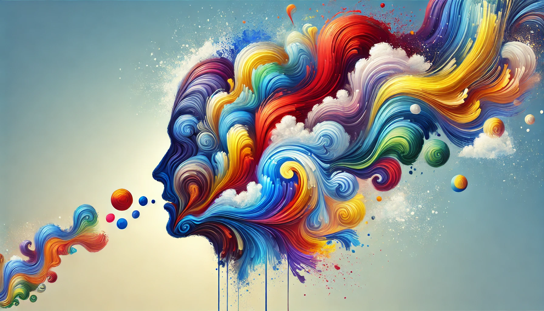
I’ve come to realise that the psychological effects of colour are like a secret sauce that can stir up our emotions, perceptions, and behaviours. It’s a total game-changer for artists and designers trying to conjure specific feelings or send messages with their creations.
Diving into colour psychology is like going on a treasure hunt, exploring the meaning and symbolism behind different hues and how they tickle our emotions in various situations. Armed with this knowledge, I can whip up artwork that strikes a chord with viewers and leaves them thinking, “Wow, that really hit home!”
The Influence of Color on Mood
Colour is like the mood ring of the universe—it wields serious influence over our feelings and can transform a blank canvas into a vibrant conversation. Artists have this magical ability to use colour as their secret weapon, communicating all sorts of emotions and themes. Take warm colours, for instance; they can spark excitement or wrap you in cosy vibes, while cooler shades are like a gentle hug that whispers serenity. It’s clear that colour perception plays a pivotal role in artistic expression.
Imagine an artist diving into their palette, splashing deep reds and oranges to capture the intensity of a fiery sunset, while soft blues and greens float in like a calm breeze to evoke the tranquillity of a peaceful landscape. In the realm of contemporary digital art, creators are the wizards of colour grading, casting spells to shape the atmosphere and emotional punch of their visuals.
And let’s not forget about the cultural baggage colours often carry! Understanding these associations can add a rich layer to an artist’s toolkit, allowing for deeper connections with a diverse audience. By giving a nod to colour theory and its psychological effects, artists can whip up pieces that aren’t just eye candy but also tug at the heartstrings, creating an experience that lingers long after the viewing ends.
The Use of Colour in Marketing and Design
I’ve got to say, the use of colour in marketing and design is like the secret sauce in branding—absolutely crucial! Different colours can stir up specific emotional responses that can sway purchasing decisions and how people perceive a brand.
So, marketers and designers are like colour ninjas, strategically picking hues based on colour psychology and the latest trends to whip up campaigns that really hit home with their audience. Understanding these principles? It’s like handing artists and designers a magic wand to create visually stunning branding that speaks volumes.
Take red, for example. This fiery colour screams excitement and urgency, which is why it’s the go-to choice for clearance sales. Brands like Coca-Cola and Tesco know this all too well; they use red to grab attention and get people to act fast.
On the flip side, there’s blue, the colour of trust and reliability, making it a favourite for financial institutions that want you to feel all warm and fuzzy about your money.
As consumer tastes evolve, keeping an eye on emerging colour trends is key. Lately, muted tones have been gaining traction, reflecting a collective yearning for authenticity and calm. This awareness not only makes things look pretty but also strengthens those emotional connections with consumers, leading to loyalty and, you guessed it, more sales.
Common Mistakes to Avoid in Colour Theory
Navigating the wild and wonderful world of colour theory feels like embarking on a vibrant adventure bursting with creativity and flair. But let’s be honest—it’s easy to trip over some common mistakes that can turn a masterpiece into a muddled mess.
Overusing colours? Check. Neglecting colour balance and harmony? Double check. These blunders can lead to a visual circus instead of the clarity we’re aiming for.
By spotting and sidestepping these pitfalls, I can seriously enhance my artistic expression and create compositions that pack a punch!
Using Too Many Colours
One of the biggest blunders I see artists making is cramming far too many colours into a single piece. It’s like throwing a party and inviting every colour in the crayon box—chaos ensues instead of clarity and harmony. Overloading my palette can disrupt colour balance and dilute the message I’m trying to convey, ultimately making my artwork less impactful. Trust me, learning to limit my colour choices can really elevate the overall vibe and enhance the emotional response from the audience.
By taking a more focused approach, I can create a visual experience that resonates with viewers on a deeper level. To start things off, I like to pick a primary colour as my foundation and then build around it with complementary or analogous shades. It’s all about creating that sense of unity! Plus, experimenting with tints and tones offers variety without sending the composition into a colourful frenzy.
Using tools like the colour wheel is a game changer for spotting those harmonious combinations, and considering how colours psychologically impact viewers can really add depth to my artwork’s narrative. In the end, keeping my colour choices simple not only clarifies my vision but also invites the audience to connect more meaningfully with what I’ve created.
Ignoring Color Temperature
Ignoring colour temperature? Oh, that’s like showing up to a party in mismatched socks—just a recipe for confusion! Warm and cool colours each have their own emotional baggage, and overlooking these differences can leave your artwork feeling flat and a bit lost, like it’s wandering around without a map. When I embrace colour temperature and use it wisely, it can seriously boost my work and make the audience feel something deeper.
Take warm colours like reds and oranges, for instance. They’re like the life of the party, sparking excitement and passion—perfect for those pieces that are all about energy and warmth. On the flip side, cool colours like blues and greens are the zen masters, bringing calmness and introspection, which is just what I need for serene landscapes or thought-provoking portraits.
A savvy artist knows how to mix things up, creating tension with a splash of contrast. Picture a sunset: the fiery warmth of the sky clashing beautifully with the deep blues of the ocean below. That’s the kind of scene that hits you right in the feels, resonating on so many emotional levels.
Not Considering Colour Contrast
If I ignore colour contrast, I might end up with artworks that are as exciting as watching paint dry—definitely not what I’m aiming for! Without that zing, it can be tough for viewers to connect with my compositions.
But once I grasp the magic of colour contrast, I can create a visual hierarchy that guides the viewer’s eye like a well-trained puppy, highlighting the key elements of my work. Embracing contrast not only makes things pop but also cranks up the emotional volume of the piece.
By mixing and matching strategic colour combinations, I can really amp up the impact of my art. Pairing complementary colours? That’s like throwing a party—vibrant energy that demands attention! On the other hand, using analogous colours helps create a soothing vibe, like a cosy blanket on a rainy day.
I also love to play around with different shades and tints to add some dimension, making sure my contrasting elements stand out without turning the whole piece into a circus. Placing bright colours against more muted tones helps me spotlight focal points and leads viewers on a delightful little adventure through my artwork.
Mastering colour contrast is the secret sauce for any artist who wants to craft visuals that are not just engaging but downright compelling.
Frequently Asked Questions
What is Paint Color Theory?
Paint Color Theory is the study of how colours interact with each other and how they can be used effectively in artwork and design. It explores the different properties and relationships of colours, such as hue, value, saturation, and temperature, to create visually pleasing compositions.
Why is it important to study Paint Color Theory?
Studying Paint Color Theory is essential for artists and designers as it allows them to understand the principles behind colour and how it can be used to convey emotions, create balance, and enhance the overall aesthetic of their work. It also provides a foundation for making more informed colour choices in their creations.
What are the primary colours in Paint Color Theory?
The primary colours in Paint Color Theory are red, blue, and yellow. These colours cannot be created by mixing any other colours and are used as the base for creating all other colours on the colour wheel.
What is the difference between warm and cool colours?
Warm colours, such as red, orange, and yellow, are associated with warmth, energy, and excitement. Cool colours, like blue, green, and purple, are associated with calmness, serenity, and relaxation. Understanding the difference between warm and cool colours is crucial in creating visual balance and setting the mood in a piece of artwork or design.
Can Paint Color Theory be applied to interior design?
Yes, Paint Color Theory can be applied to interior design. By understanding the principles of colour, interior designers can create harmonious colour schemes that enhance the overall atmosphere of a space. They can also use colour to influence the perception of size and shape in a room.
How can I learn more about Paint Color Theory?
There are many resources available to learn more about Paint Color Theory, including books, online courses, and workshops. If you are new to the subject, it is recommended to start with the basics, such as the colour wheel and colour relationships, and then gradually move on to more advanced concepts. Experimenting with colour in your own artwork or design projects is also an excellent way to deepen your understanding of Paint Color Theory.
